
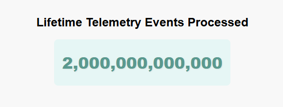
We’ve just passed a monumental milestone: 2 trillion events processed through Report URI!!! That’s 2,000,000,000,000 events for CSP, NEL, DMARC, and other browser-generated and email telemetry reports—ingested, parsed, and processed for our customers!
This is a phenomenal milestone to achieve in the year that will mark our 10th Birthday, and shows just how quickly we're still growing!
May 2015: 0 Events - Launch Day [source]
March 2021: 500,000,000,000 Events - 500 Billion Events [source]
February 2022: 1,000,000,000,000 Events - 1 Trillion Events [source]
November 2023: 1,500,000,000,000 Events - 1.5 Trillion Events [source]
July 2025: 2,000,000,000,000 Events - 2 Trillion Events [keep reading!]

To mark this incredible occasion, I'm excited to announce the Report URI Global Telemetry Dashboard. I often get questions about how many telemetry events we process per day, how many browsers send us telemetry, where does the telemetry come from?! Well, now, you can see the answer to all of those questions and a lot more. If you like cool graphs, geeky data, and insights into things operating at enormous scale, you're really going to enjoy this! 😎
The Report URI Global Telemetry Dashboard
Taking screenshots and sharing them here really isn't going to do this justice, and there is a special surprise on one of the dashboards that I'm not going to spoil for you here! If you want to see all of this stuff live and have a play around with it yourself, head over to the dashboard now. For those of you still here, I want to share some information and insights into the data.
As of the time of writing, this is the exact data showing on the homepage of the dashboard:
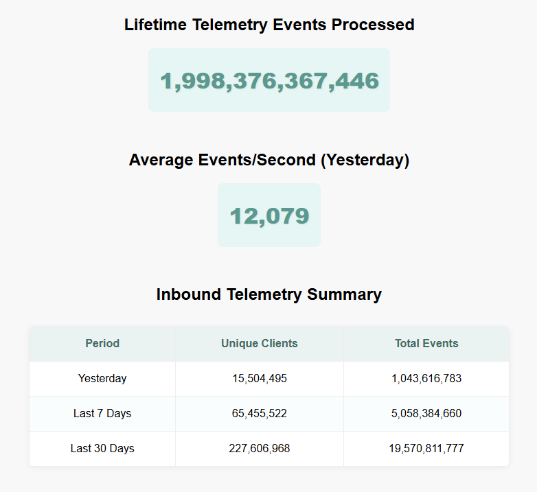
That incredible number of almost 2 trillion events processed is right there, and a pretty incredible average of over 12,000 events per second that we processed yesterday! The thing that always strikes me about this number is that this isn't requests that we're serving a response to, nothing here can be served from cache. Each inbound event needs processing, analysing, and storing, with the potential for alerts to be raised, Threat Intelligence to be generated, customers to be notified and much, much more. Another impressive statistic is just how many unique clients out there are sending us telemetry data, reaching almost a quarter of a billion unique clients in just the last 30 days! That's a huge amount of insight into the Web ecosystem and a significant contributing factor to the benefit we can bring by leveraging that insight to spot attacks faster. The remainder of the Dashboard Home page shows additional insights into our traffic volumes, showing the hourly data for the last 24 hours, and the daily data for the last 7 and 30 days.
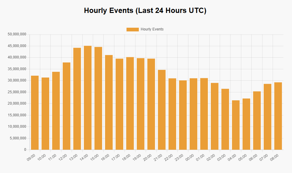
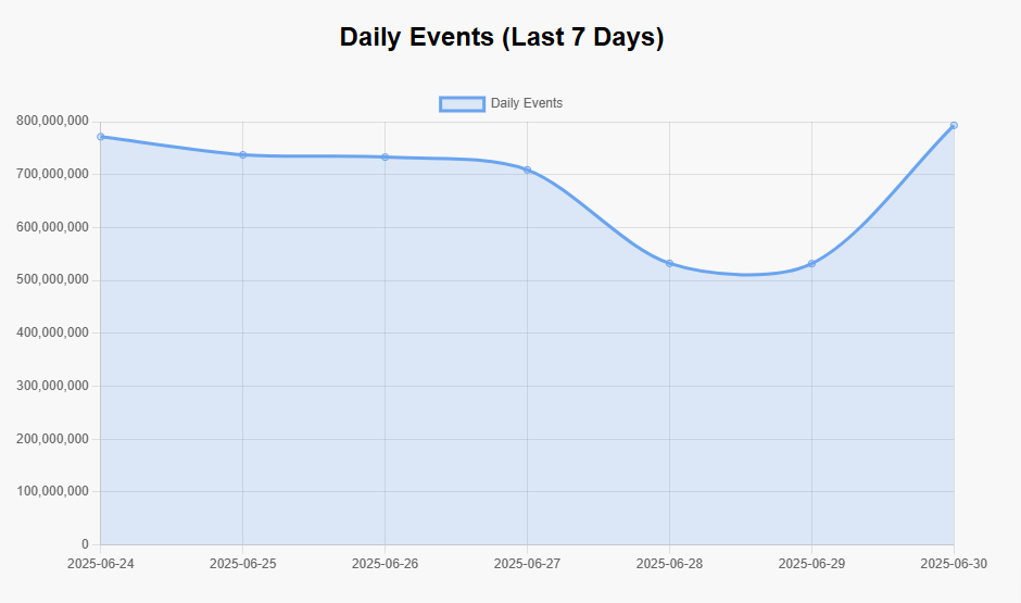
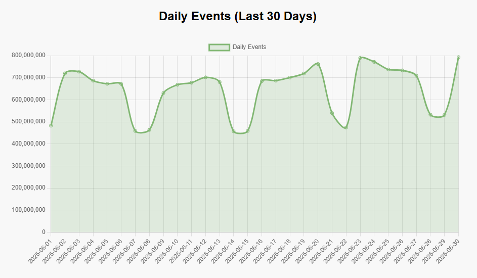
You can already start to see some interesting trends in that data, and these are trends that we've been tracking for a really long time. The 24 hour graph clearly shows the busy periods within a typical day for us, and it's not surprising to guess at what time of the day we see the most telemetry! Both the 7 day and 30 day graphs show our typical weekly trends too, with far more activity showing Mon-Fri than at the weekend.
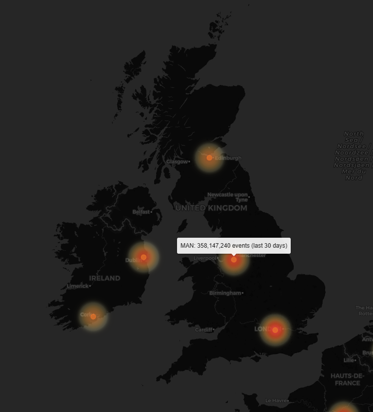
The Global Heat Map
This particular page in the dashboard is my second-favourite, and it's easy to see why. Looking at the telemetry we received over the last 30 days, this heat map shows where that telemetry came from!
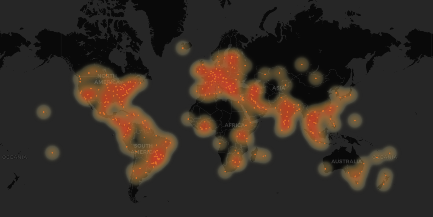
You can zoom in to the map and really start to see where the busiest locations for us receiving telemetry are, with some expected locations showing up as the hottest areas of the map, and some more surprising areas showing up in there too! Zooming all the way in to the datacentre just down the road from me in Manchester, you can see exact counts of telemetry that went through that location in the last 30 days.
Have a fly around the map and see what your nearest location is and what volume of telemetry went through that location in the last 30 days on our Heat Map!
We have a Pew Pew Map!
Okay okay I said I wasn't going to spoil the surprise, but I am way too excited about this one! Ever since seeing the original Norse Attack Map over 10 years ago, I've always wanted my own Pew Pew Map, and now we have one! The GIF here is simply not going to do this justice, so you absolutely should head over to the page and see this thing live, in action, right now!
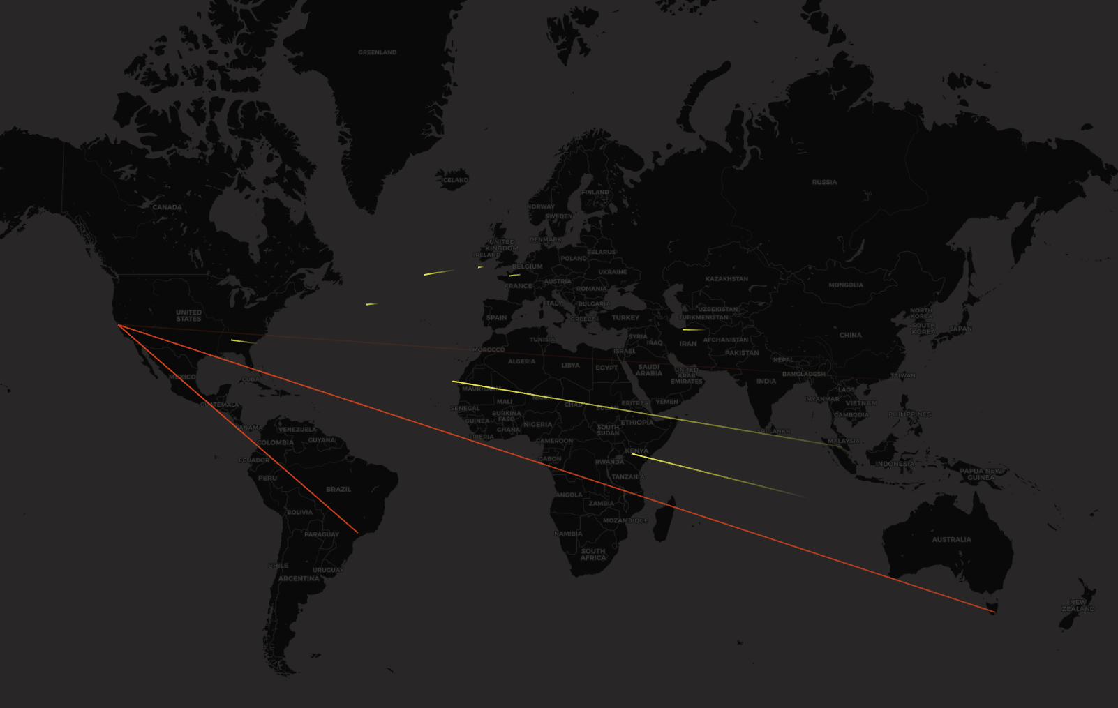
What you're seeing here is actual telemetry being to sent to us! The map is 5 minutes behind real-time, and the data is real. The more red the zap is, the more telemetry we received from that location, and the faster the zap is moving, the more frequently we are receiving telemetry from that location! There are no estimations here, there is no mock data. This is a direct representation of real data, and I think that just makes this even more awesome! Our primary datacentre is located in SFO, as I'm sure you've guessed, and we do have a secondary location in AMS for our more regulated EU customers, but they are excluded from this data.
I'm tempted to get myself a second monitor off to the side of my desk just for this map, it really is quite cool to watch. If you come back at different times during the day, you can clearly see the different trends in our traffic patterns for inbound telemetry, to the point where you can almost track the Sun moving across the map based on the telemetry volumes!
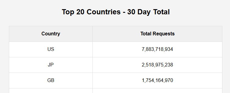
Country Specific Data
There's just no way you can top a Pew Pew Map, but we do still have a heap of interesting data that we can peruse. The next page is our Country Specific Data, which in many ways shows exactly what you might expect, with a couple of surprises in there too.
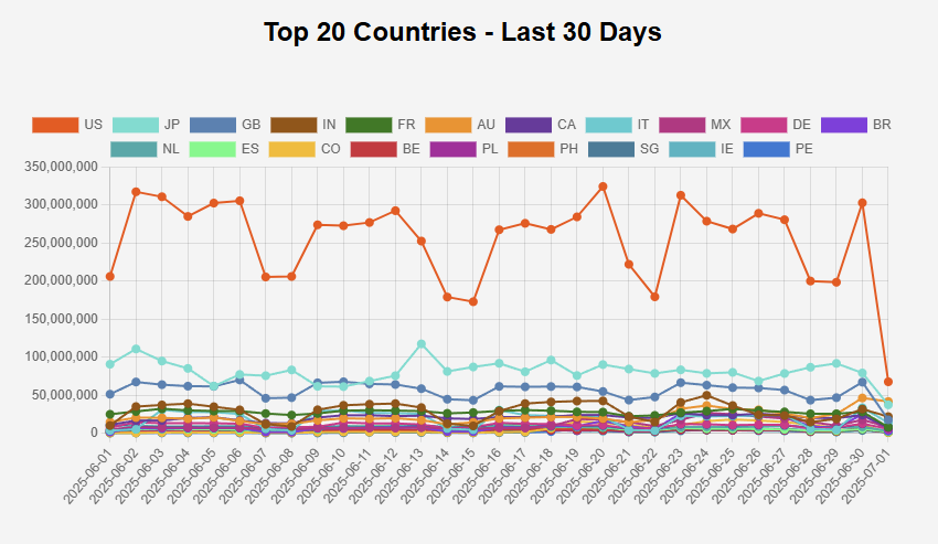
The US is by far our largest source of telemetry data, which makes a lot of sense as a large portion of our customers are US-based companies, likely with US based visitors themselves. People may be surprised to see Japan so high up that list, but we do have a few quite notable customers in Japan, including a rather large coffee company, so they generate more than their fair share of telemetry. After that, the UK is coming in, followed by India that are helped by their population size, and then a broad selection of countries that you might expect to see up there too. The table below that gives exact details on our Top 20 Countries, but here are the top 3 for you.
Some technical data!
To close things out for now, we have our Detailed Information dashboard that goes into a little bit more of the technical data behind our inbound telemetry. We do have plans to expand this to incorporate a lot more metrics, but for now, I think we have a pretty good selection available.
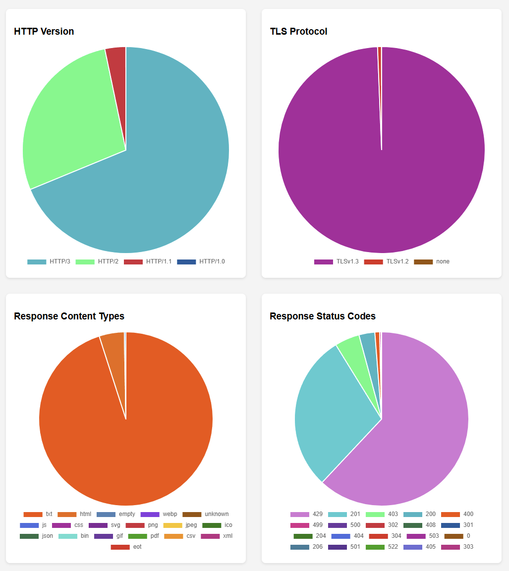
Looking at the HTTP Version and TLS Protocol used, you can see that we clearly have a very wide selection of modern clients out there, using TLSv1.3 almost exclusively, and HTTP/2 and HTTP/3 taking the lion's share of the application protocol. When responding to inbound telemetry requests, our most common response is an empty txt response to save as much bandwidth and overhead as possible, we simply reply with an empty 201 to acknowledge receipt. After the 201, we have a variety of response codes that we might use along with a message in the body to give more information on the problem to help with debugging.
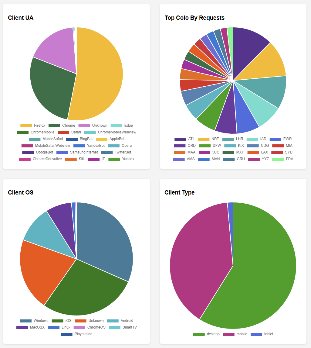
Taking a look across the next set of data, I'm often quite surprised to see Firefox so heavily represented in the Client UA, but there are a wider selection of Chromium based browsers in the mix. The front runners for Top Colo By Requests won't be a huge surprise given the country data above, but it is nice to see a breakdown of where our most popular locations are. Closing it out, we have a little more client data showing the Client OS, with a probably expected Windows and iOS being the most dominant, and Client Type showing that Desktop is hanging on to the top spot with Mobile close behind!
There's more to come!
I created this dashboard to scratch an itch, I got to play with some cool data, and as I mentioned above, I've always wanted a pew pew map! I also really enjoyed stepping away from the more serious responsibilities of being 'CEO and Founder' to play around with cool technology and build something awesome! That is, after all, why I founded the company in the first place.
I hope the dashboard will be interesting and provide some insight into what we're doing, and if there's something you'd like to see added to the dashboard, or any questions you have, just let me know in the comments below. As I come across any interesting metrics in the future, I'll be sure to add them to the dashboard, and I'd love to hear your suggestions too!