
We've seen a couple of changes in the Chrome UI recently and one of them attracted some pretty fierce criticism online rather quickly. With the removal of some of the URL components from the address bar I was quite relieved so see a simplification of this complicated UI feature. Turns out that not everyone felt the same way!
The Chrome UI Change
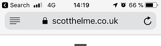
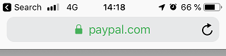
In Chrome 69 we saw the removal of the www and m subdomains from the URL in an effort to simplify things. This meant that if I hosted my blog on www.scotthelme.co.uk you would only see scotthelme.co.uk in the address bar. This change didn't affect me because I don't use the www subdomain but Troy does, his site went from www.troyhunt.com to troyhunt.com instead. The UI was further simplified as the 'Secure' chip was also removed from the address bar, leaving behind only the padlock icon which was also changed from green to grey.
Websites: Look for the green padlock in the address bar!
— Scott Helme (@Scott_Helme) September 5, 2018
Chrome: Hold my beer 😎 pic.twitter.com/BPMMXHKbGx
All in all there is less 'stuff' in the address bar which means there is less 'stuff' to confuse the user trying to read it. I think simplifying the URL is a great thing to do and something that is desperately needed.
What's in a URL?
A URL has a lot of componenets, many of which we don't generally see but potentially quite a few.
{scheme}{username}{password}{host}{port}{path}{query}{fragment}
Now, in fairness, we will very rarely see the username or password portion of that URL and the port is often hidden too (no one loses their minds about this part of the URL being hidden), so let's give a more accurate representation of what a typical user might see.
{scheme}{host}{path}{query}{fragment}
I think that's representative of exactly what you could expect to see in your address bar so let's look at a real URL that would fit this criteria.
https://www.scotthelme.co.uk/some-awesome-blog/?source=twitter#introduction
Now, just for a second, imagine this URL in the hands of a non-security/non-technical user. If you had to ask them to parse this URL into the components, accurately, could they do it? Could you do it? Reliably, every single time? The answer, if we're being honest, is no. This is an incredibly difficult task for the best of us and it only gets harder as the user has less technical knowledge. Not only that, but this is the most simple example I could create! What if the URL is trying to be deceiving, trying to trick the user? Try this one.
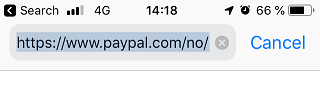
https://paypal.com-secure.me/trusted-login/auth?user=scotthelme#approve
How about now? In this example we can see how the host component can be further broken down into domain and subdomain. This further complicates the task at hand but is critically important because a confusion between the two could lead to devastating consequences. I think there's a pretty easy solution to help people out here.
Which components do we really need?
Let's take my PayPal URL example above and go with that because I like it and it demonstrates the point I want to make nicely. Here are each of the components.
{scheme} https://
{subdomain} paypal
{domain} com-secure.me
{path} trusted-login/auth
{query} user=scotthelme
{fragment} #approve
I'm going to jump straight to the point here and ask you one very simple question. You're on a page, it looks like PayPal, it has PayPal branding, it's asking for you PayPal login details and you need to login to pay an invoice. Which one, single component of the URL do you need to determine if you're on the right website?
...
It's just the domain. Forget all of the others. The subdomains only confuse matters, the path doesn't matter and the query and fragment don't bring anything to the party either. The only one thing you need to look at is the registered domain of the site you're on. Everything else just gets in the way.
https://paypal.com-secure.me/trusted-login/auth?user=scotthelme#approve
https://paypal.com-secure.me/trusted-login/auth?user=scotthelme
https://paypal.com-secure.me/trusted-login/auth
https://paypal.com-secure.me
https://com-secure.me
com-secure.me
Give that list of domains to a user and ask which are genuine sites that they could login to PayPal and which ones are phishing sites they should not login to. I'd bet good money on the results.
We already see this all around us
One of the things that really struck me as odd with all of the people losing their minds about this change was just how much we already see this happening all around us. I can't take any credit for this great idea, I'm just observing what's happening and pointing out how great it is! Take links in the Facebook app, which open in the apps native browser.

Facebook is only one of the largest apps in the world and responsible for who knows how much browsing, but can anyone tell me when Facebook changed this? How long have they been doing it for? Why are they doing it? Chrome on Android is still doing the whole URL thing and trying to squish it into that tiny address bar so they obviously believe there's still space even on a mobile UI for this.
Then of course we have the beloved Safari which given the prevalence of mobile devices running iOS is a pretty significant browser. You only see the registered domain during normal browsing but if you want the full URL you simply click into the address bar.
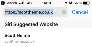
This isn't a space saving feature on mobile devices with smaller screens, it's exactly the same on macOS too. You get the registered domain by default and the full URL when you click into the address bar.
All in all there are already many huge examples of where UI like this works every single day. The whole fanfare around "Google is killing the URL" seems to have blown up from nothing but catchy headlines and mind-losing by a few. No one is killing the URL, the full URL was still available after the Chrome changes, all you had to do was click into the address bar and it displayed the full URL ready for copying or inspection if you chose to. For some more info on how hard URLs are and to see the awesome Emily Schechter in action (one of the people behind Chrome making decisions about stuff like this) check out this talk earlier in 2018 from LocoMocoSec in Hawaii (tough gig, right).
All said and done I think the backlash to the Chrome change was blown way too far out of porportion and the change was a step in the right direction that we needed. Yes, there was a bug in the implementation and yes of course that should be, and was, fixed, but I really don't think that has a bearing on the efficacy of the UI change itself. We've seen a lot of simplification in the browsr UI with recent changes around the Secure chip and the neutral grey we now see on the padlock and I think further simplification will be a further benefit. Let's show the user only what they need, remove uneccesary data and make things easier.